Chart types
Optimize how question data appears by using different chart types.
Use different chart types to add visual interest to a shared report, a presentation, or an email. The selection of chart types varies depending on the question type.
- To view your truncated long answer in a tooltip, hover over the bars in the chart.
- For more information about how to edit your answer text, see Relabel answer text.
Bar Chart
A Bar Chart displays answer data as horizontal, left-aligned bars. Bar Charts are suitable for a wide variety of question types, and they are the default chart view for Choice and Grid questions.

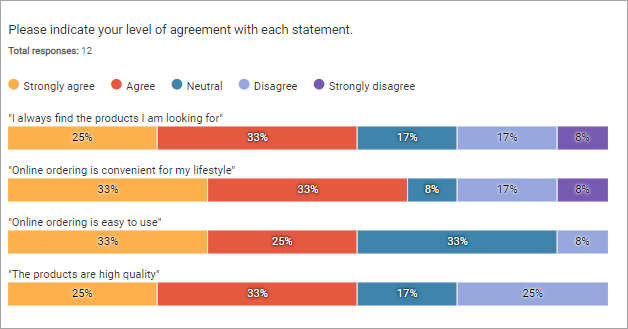
Stacked Bar Chart
Like a Bar Chart, a Stacked Bar Chart displays answer data in horizontal, left-aligned bars. Color-coded sections in each bar show how participants answered. Stacked Bar Charts are ideal for Rank Order questions and Single Choice Grid summary tables, because they let you see the distribution for an answer at a glance.
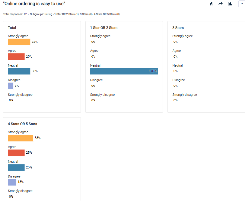
Small Multiples Bar Chart
A Small Multiples Bar Chart displays individual, small-scale bar charts for each subgroup segment. This chart type makes it easier to spot patterns between subgroups.
You can only use the Small Multiples Bar Chart if you have added subgroups to your report.
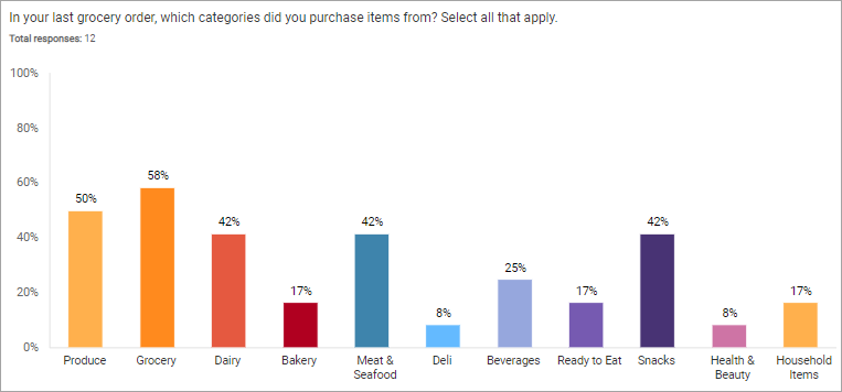
Column Chart
A Column Chart displays answer data in vertical columns. The answer text is displayed on the horizontal axis beneath each column, while the vertical axis marks percentages. Column Charts work well for any type of Choice question; however, a Bar Chart may be a better choice if the question has a lot of answer options because there is more space to display answer text.
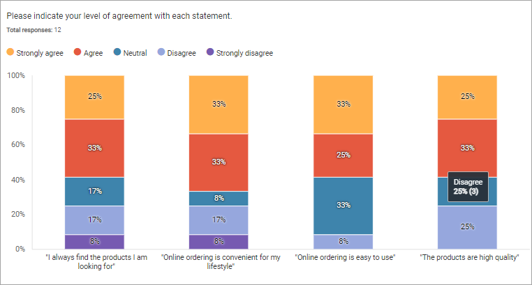
Stacked Column Chart
Like a Column Chart, a Stacked Column Chart displays answer options in vertical columns. The answer text is displayed on the horizontal axis beneath each column, while the vertical axis displays percentages. Color-coded sections in each column show how participants answered.
Stacked Column Charts are ideal for Single Choice Grid summary charts, as they convey a lot of information about answer distribution at a glance.
Pie Chart
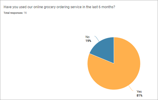
A Pie Chart displays answer options in a whole circle. Color-coded sections show the proportion of participants who chose an answer. You can use Pie Charts to give Single Choice questions and Single Choice Grid rows a more interesting look.
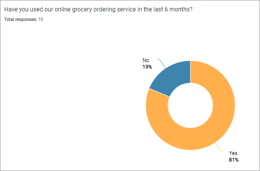
Donut Chart
A Donut Chart displays answer options in a circle with a hollow center. Color-coded sections show the proportion of participants who chose an answer. You can use Donut Charts to give Single Choice questions and Single Choice Grid rows a more interesting look.
