 Chart types in modern
reports
Chart types in modern
reports
You can customize your report by selecting from a variety of default chart types.
The chart types available depend on the data tile and tab selected. The available charts correspond to the data being displayed in the tile. You can quickly switch between chart types, and the display of the chart, including the chart elements, fonts, title, and legend is set automatically using built-in configuration settings. You can control the colors used in the chart by defining a custom theme template.
If you need additional control over how you customize a chart or want to use a chart type that is not available as a default chart type, you can use the AI Assistant (beta) to generate the chart and insert it into your report. Note that AI Assistant-generated charts are not dynamically updated and include the data available when the chart was generated.
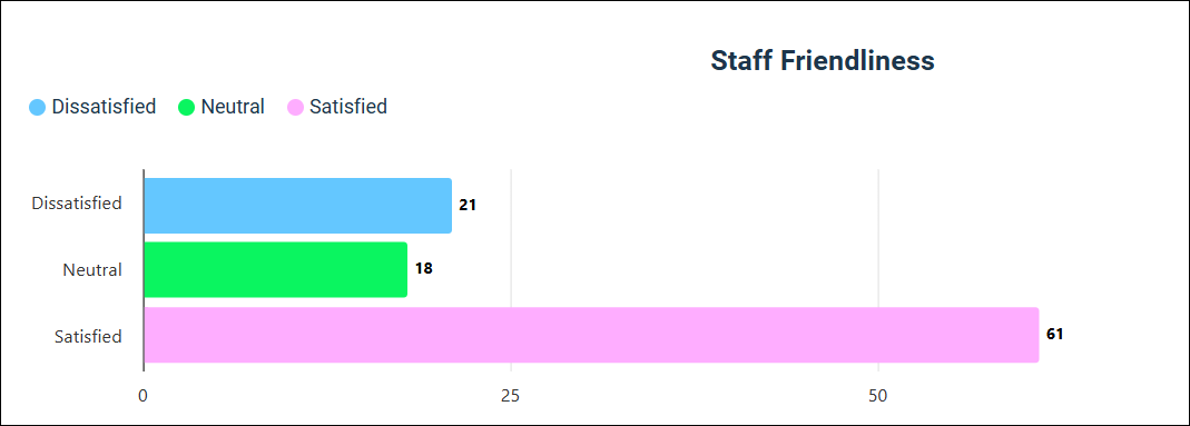
Bar chart
This is the default visualization for Single Choice, Multiple Choice, Rating, and Number questions. It displays answer data as horizontal bars, making it ideal for ranking items or displaying questions with long answer labels.
Stacked Bar chart
This is the default for Rank Order and Single Choice Grid summary tables. It divides horizontal bars into sub-segments, allowing you to view the distribution of the whole (total length) and the parts (segment length) simultaneously. This chart type lets you see the distribution for an answer at a glance.

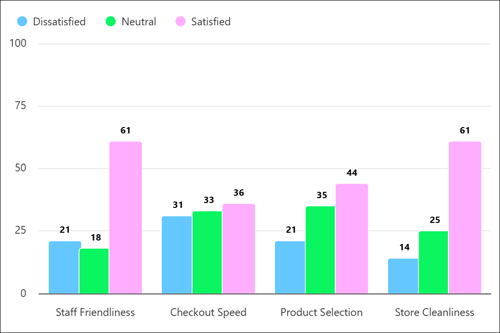
Column chart
Displays data using vertical rectangular bars, where the height of the bar represents the value. They are best used for comparing data across categories or showing how values change over a specific period. However, a Bar chart may be a better choice if the question has a lot of answer options because there is more space to display answer text.
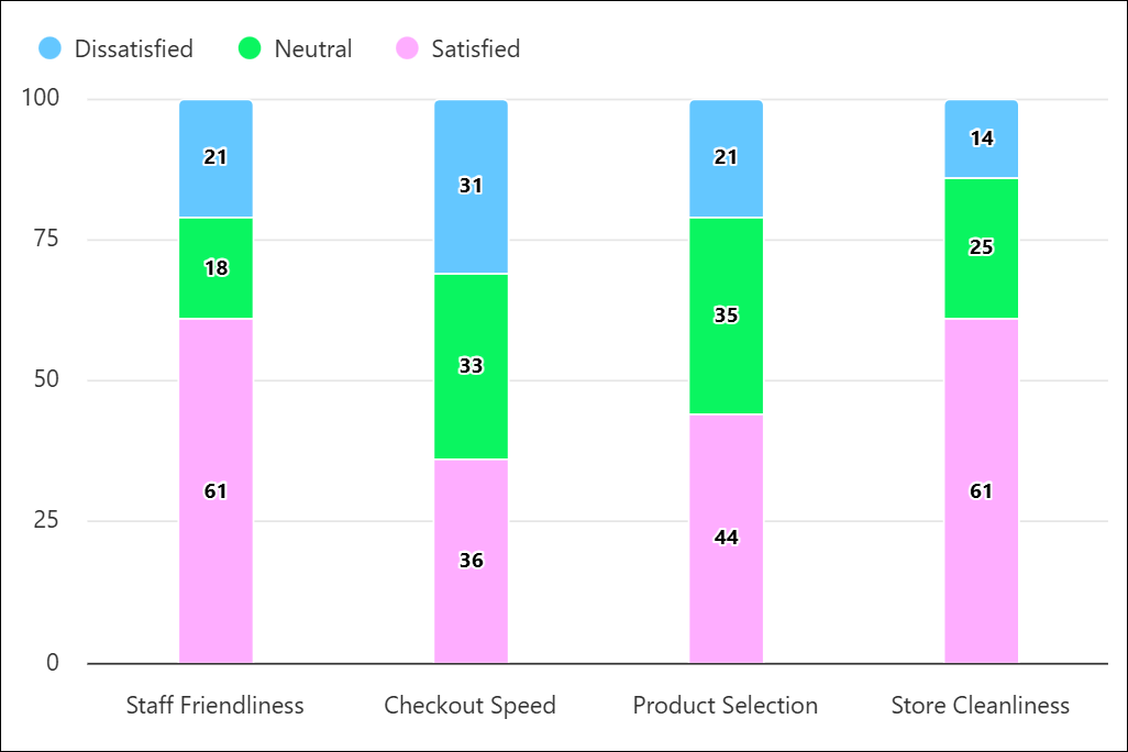
Stacked Column chart
Vertical bars divided into sub-segments. It shows the whole (total height) and the parts (segment height) simultaneously. This type of chart is best used when you need to show totals while also visualizing the breakdown of those totals.
Stacked Column charts are ideal for Single Choice Grid summary charts, as they convey a lot of information about answer distribution at a glance.
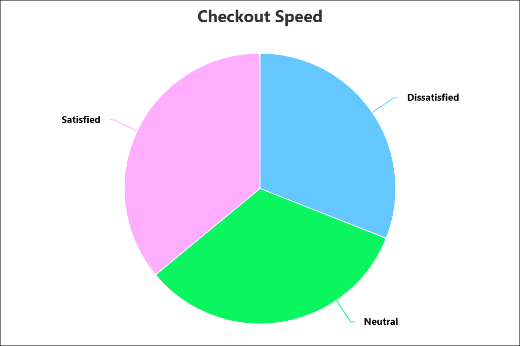
Pie chart
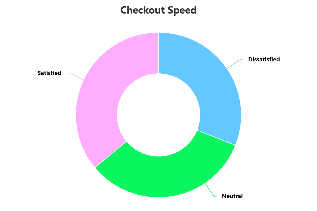
Donut chart
A Donut chart is essentially a Pie chart with the center cut out. It functions the same way but offers a lighter visual weight.
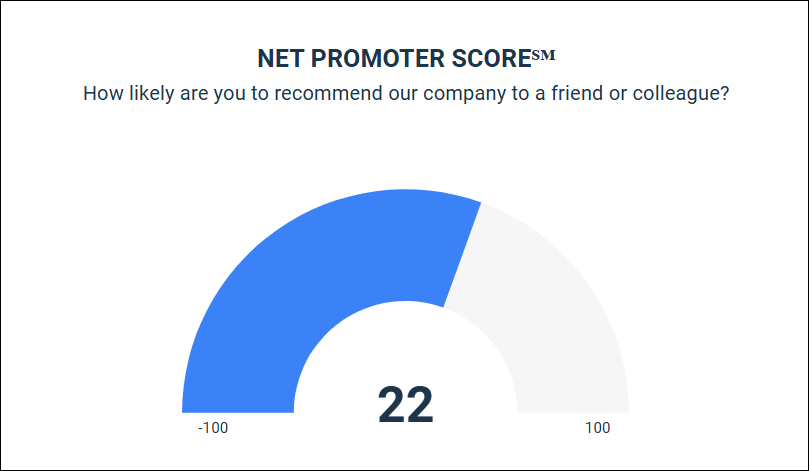
Gauge chart
This is the default visualization for Net Promoter Score℠1 questions. It mimics a speedometer to display the NPS℠ from -100 to 100.