 Question properties
This section describes each property that may appear in the Properties section of the Question Editor. A description of the property, as well as which question type or types it applies to, is given for each property.
For more information about editing your question text or emails, see Editing toolbar.
Allow Back Button
This property works in tandem with the survey wide property of the same name on the details page. When the back button is turned on for a survey, this property allows you to override the setting on a question-by-question basis. It is useful for hiding the back button after showing questions the participant should not be able to answer twice.
Applies to: All question types
Allow Magnet Positioning
Allows the participants to place magnets where they want on the boards, rather than placing them in fixed positions.
Applies to: Multi Choice, Magnetic Boards
Answer Orientation
Select Columns (fill left to right) to show answers across and then down (horizontal).
Select Rows (fill top to bottom) to show answers down and then across (vertical).
Applies to: Multi Choice, Single Choice
Apply Custom Layout
When selected, allows you to arrange answer columns horizontally or vertically, set the number of columns, and adjust the font size.
Applies to: Single Choice and Multi Choice Buttons
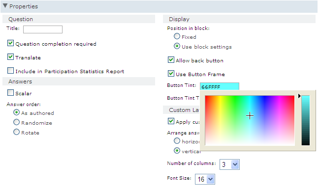
Button Tint
Determines the color of the button. You must enter a hexadecimal value. For example, 66FFFF. This setting works in conjunction with the Button Tint Transparency property. You must set both of these to see a result on your buttons.
Applies to: Single and Multi Choice Buttons
Button Tint Transparency
Determines the transparency of the buttons. You must enter a value between 0 and 100. This setting works in conjunction with the Button Tint property. You must set both of these to see a result on your buttons.
Applies to: Single and Multi Choice Buttons

Using a Button Tint value of 66FFFF and a Button Tint Transparency value of 100, the buttons looks like this:

The same question with a Button Tint Transparency value of 30 looks like this:

Decimal Place(s)
This property determines how many decimal places participants can include in their answer. You can allow up to four decimal places. By default, no decimals places are allowed.
Default Value
The default value that will be displayed for each option in the grid.
Applies to: Allocation Grid
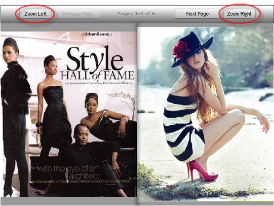
Enable Zoom
By default, participants can zoom in and out on each image. Clear this option to prevent participants from zooming.
Header Column Width
Allows you to set the width (in pixels) of the column header in the top left corner of a grid.
Header Row Height
Allows you to set the height (in pixels) of the row header in the top left corner of a grid.
Height
Height, in carriage returns, of the text box. The default height is 1.
Applies to: Highlighter, Numeric, Open End
Include in Participation Statistics Report
Select this property if you want to see the responses to this question in the Participation Statistics Report.
Is Private
Select when answers should not be viewed by anyone other than an Administrator and should not be included in survey reports. This option should be selected when you are collecting information of a confidential nature such as email addresses, account numbers, or user passwords.
Is Private can only be toggled by Administrators before the study has live responses. This option cannot be changed after the study has collected live data.
- If ExportPrivateInformation is set to False, Administrators cannot export private data.
- If ExportPrivateInformation is set to True, Administrators can export private information, but other users such as Authors cannot export this data.
To change the community settings, contact Alida Technical Support.
Applies to: Open End questions and the Answer (Other-Specify) option in Choice questions
Maximum Height
This property determines the maximum allowable height, in pixels, of uploaded images.
By default, the maximum height is 600 pixels.
Maximum Selection
This property sets the maximum number of selections that a participant can make for each row in a grid.
For example, if this property is set to 3, participants cannot make more than three selections per row.
Maximum Size
This property determines the maximum allowable size, in kb, of an uploaded image.
By default, the maximum size is 500 kb.
Maximum Total
The maximum number that all the values entered can add up to. For example, if you want participants to enter values that equal not more than 100 in total, enter 100 for this property.
Applies to: Allocation Grid
Maximum Width
This property determines the maximum allowable width, in pixels, of uploaded images.
By default, the maximum width is 800 pixels.
Maximum Year
This property sets the latest year that is available to participants in the Select a year list of a Date question. The default value is 2019.
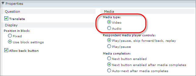
Media type
This property sets the file type: Video or Audio. The default value is Video.
Minimum Height
This property determines the minimum allowable height, in pixels, of uploaded images.
By default, the minimum height is 600 pixels.
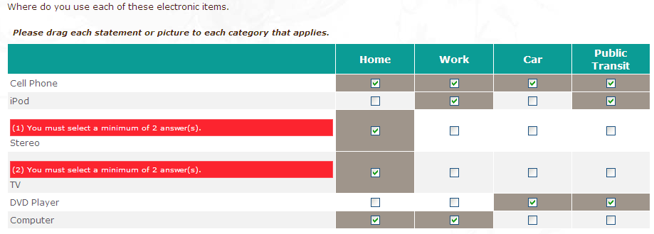
Minimum selection
This property sets the minimum number of selections that a participant must make for each row in a grid.
For example, if this property is set to 2, the participant must make at least two selections for each row.
Minimum Size
This property determines the minimum allowable size, in kb, of an uploaded image.
By default, there is no minimum size set. If you set a minimum here, participants who attempt to upload an image that is smaller than the minimum will receive an error message instructing them to upload a larger image.
Minimum Total
The minimum number that all the values entered can add up to.
For example, if you want participants to enter values that equal at least 50, enter 50 for this property.
Applies to: Allocation Grid
Minimum Width
This property determines the minimum allowable width, in pixels, of uploaded images.
By default, the minimum width is zero pixels.
Minimum Year
This property sets the earliest year that is available to participants in the Select a year list of a Date question. The default value is 1900.
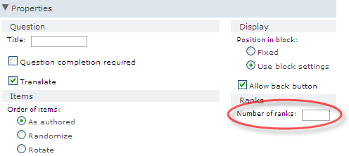
Number of ranks
This property determines the number of ranks that participants can use. Enter the number of ranks that you want your question to have.
If there are three ranks and five answers, the participant can only rank three answers. If you leave this field blank, there will be as many ranks as there are answers.
Number of Rows/Columns
Allows you to set the number of columns or rows you want your answers to be displayed in. This property works together with the Arrange Answers property.
Applies to: Multi Choice, Single Choice
Obscure answer
If this property is selected, the response is hidden when panelists respond to the Open End question.

By default, Obscure answer is unchecked.
- The Validation property is set to Email Address.
- The Height property is greater than 1.
Applies to: Open End questions
Order of
Select how answers, columns, rows, cards, categories, magnets, sliders, or items are displayed to participants.
Select Randomize to randomize the order in which your response list is displayed to each participant.
For example 1,3,2,4 or 2,3,1,4 or 3,1,4,2, and so on.
- Rows that are marked as fix position will always maintain their location in the row list.
- Randomization does not affect the order of answer options in reports or exports. The application will maintain the position of precodes as authored in exports or reports.
Select Rotate to maintain the order of the rows in a grid question, but rotate the display of the row list displayed to participants with a different start point each time.
For example rows may be displayed 1,2,3,4 or 3,4,1,2 or 2,3,4,1 but not 4,3,1,2.
Select None to apply neither of these settings.
Applies to: All questions except Text Instructions, Open End, Numeric, and Date.
Position in Block
Under Position in block, select Fixed to maintain the question's current sequential position, or select Use block settings if the question is part of a block that randomizes or rotates questions.
Question Completion Required
Select whether the participant must provide an answer for this question or not.
Applies to: All questions except Text Instructions, Allocation Grid, and Allocation Slider.
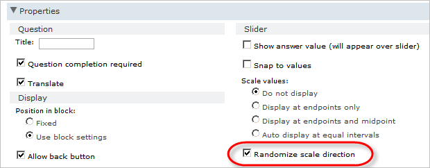
Randomize Scale Direction
You can use this property to randomize the scale direction. If selected, each time the Numeric Slider question is presented the scale direction randomly changes.
Repeat header every
Enter the interval of rows that you would like the header displayed. For example, if you enter 3, the header will be repeated after every three rows. This is useful if your answer options extend beyond the bottom of one screen, requiring the participant to scroll. If you set the header to repeat after the number of rows that fits onto a screen, the header will always be visible for participants.
Required
Select to prevent the participant from continuing the survey without providing an answer. For grids, this will enforce an answer for every row.
Applies to: All question types
Required cards
This property determines the number of cards a participant must place before they are able to move on to the next question.
Required row count
Set to the number of rows that the participant needs to answer in order to move to the next question.
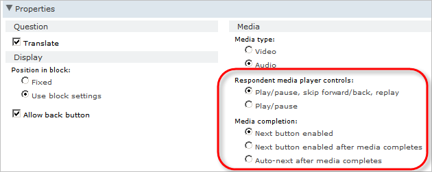
Respondent Media Player Controls and Media Completion
You use these two properties together to set the media player behavior for participants.
| Option | Description |
|---|---|
| Play/pause, skip forward/back, replay | Gives participants the full set of player controls. |
| Play/pause | Gives participants the option to play or pause the media file. |
| Option | Description |
|---|---|
| Next button enabled | Displays the Next button for the Media question. |
| Next button enabled after media completes | Enables the Next button only after participants play the entire media file. |
| Auto-next after media completes | Proceeds to the next question without requiring participants to click Next. |
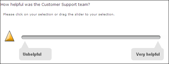
Scale Values
By default, scale values are displayed at the endpoints of the scale only.


You can choose to:
-
Not display the scale values. This is the recommended option for semantic differential questions, as participants will use the labels, as opposed to the Scale Values, to determine their response.
-
Display the values at the endpoints and the midpoint.

-
Auto-display the values at equal intervals. Community will calculate the values.

Sensitive Data
This property will automatically purge data 90 days after the participant becomes inactive. After the data is purged, you cannot access it again.
Sensitive Data is available on request. For more information, see Purging sensitive data.
Applies to: Open End, Numeric, Date, and Member Image Upload
Show As
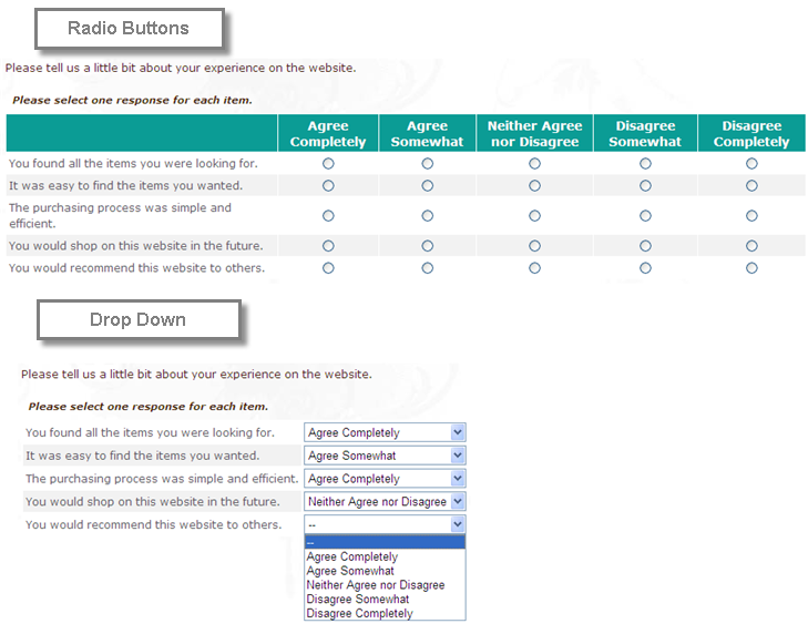
Determines how the question will be displayed to participants. Depending on the question type, you can choose to have the response list displayed as Radio button, Dropdown, Check Boxes or List Box.
Applies to: All questions with response lists
Snap to values
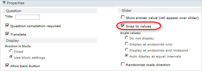
If Snap to values is selected, when the participants moves the slider along the scale, the slider will automatically move to the integer value closest to it. By default, this property is selected.
Text Entry Fields
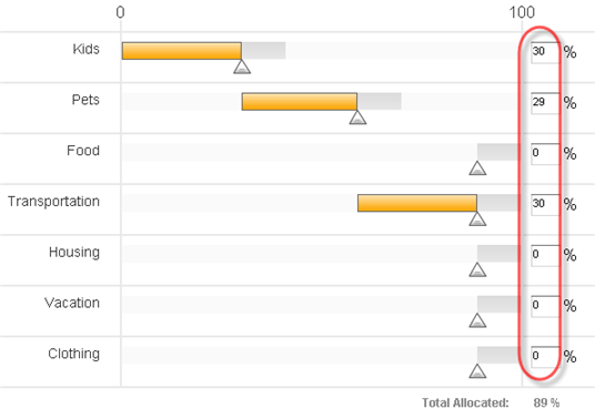
If this property is selected, text fields are added to the right of each slider. This allows participants to enter exact unit amounts or use a mouse to drag the slider.
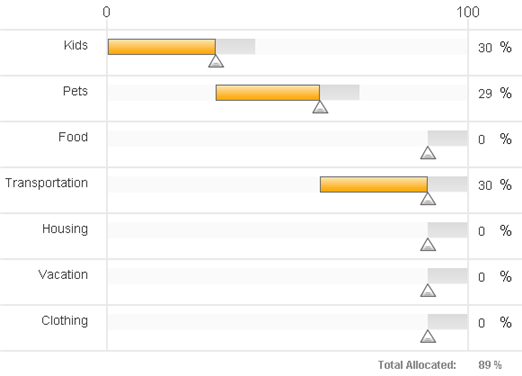
If this property is clear, participants must use the sliders to indicate unit amounts.
Applies to: Allocation Sliders
Tick Marks
If this property is selected, the top of the sliders have markers that indicate 0 and the total number of points to allocate.
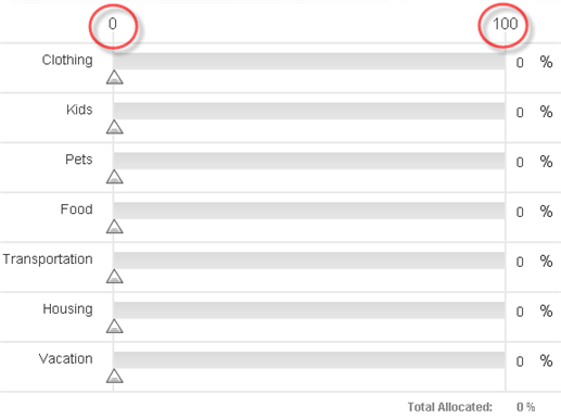
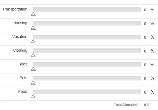
If this property is cleared, no markers or unit range is shown.
Applies to: Allocation Sliders
Title
Use the Title property to enter a heading that will appear on reports instead of the question name. This property is helpful if the question name is vague or cryptic.
Total to Allocate
This property sets the total units that can be allocated using sliders. The default total is 100, but it can be reset to anything from 1 to 10,000.
If the Total to Allocate value is very high, the allocation sliders will snap to an approximate value instead of allowing participants to select an exact value. For example, participants may be able to select 2680 or 2700 but unable to select a value in between.
Translate
If you want the question to be included in survey translations, ensure that the Translate option is selected. By default, this option is selected.
Units
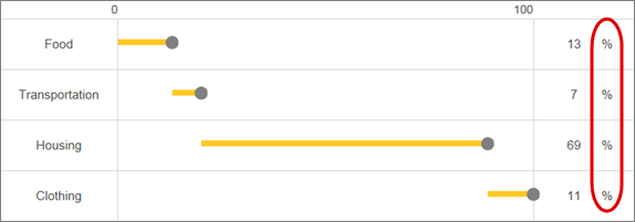
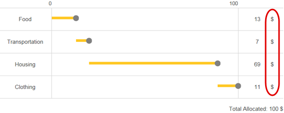
Enter the unit that you want displayed on the Allocation Slider. For example, % or $.
The default unit is percent (%).
Units position
Select preceding value to display units before values. For example, $50.
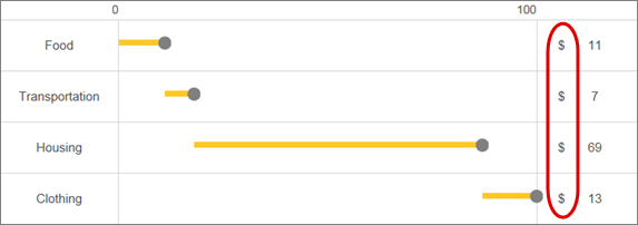
Select following value to display units after values, for example, 50$.
Use Button Frame
Validations
By selecting a validation type, you require the participants to answer the question in a certain way. Thus, if you select email the member will have to answer with a valid email address.
Applies to: Open End
Width
This property sets the width, in text characters, of the field in which participants type their answer. The default value is 45.