Create a Sentiment visualization
Display sentiment data from responses as charts or tables.
- Click the Visualizations tab at the top of the page.
-
Click
New
Visualization > Sentiment.
Tip: You can click New Visualizations above or below an existing visualization.

- Optional:
Edit the visualization's title.
By default the application uses the question text.

-
Change the chart type.
-
In the
View section, select a chart type:
Button Chart type Description 
Bar Chart Displays sentiments as horizontal, left-aligned bars. 
Column Chart Displays sentiments as vertical, left-aligned bars. 
Pie Chart Displays sentiments as a pie chart. 
Donut Chart Displays sentiments as a donut chart. 
Table Displays sentiments as a table.
-
In the
View section, select a chart type:
-
Click
Settings to change the report settings.

Table 1. Bar Chart, Column Chart, Pie Chart, and Donut Chart. Note: Sentiment visualizations display four sentiment colors (Positive, Neutral, Negative, and Mixed).Settings Options Data Chart Labels:
- Show Counts: Count the number of times the sentiment appears in the records.
- Show Percentages: Display the sentiment frequency as a percentage.
- Show Both: Display the sentiment frequency as both a number and percentage.
Percentage Base:
- Use Total Records: Display the percentage based on the total number of records.
- Use Sentiment Records: Display the percentage based on the number of sentiment records.
Theme Note:- If you do not have sentiments applied, the application defaults to the Bar Color.
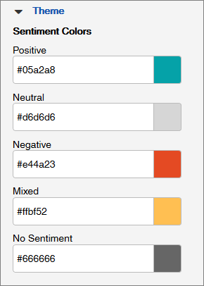
- If you select Show Sentiments, you can select the Sentiment Colors.
- If you select Hide Sentiments, you can only select the Bar Color for charts.
- Bar Color: Select a color with the color picker or enter in a hex code (for example, #05a2a8).
- Sentiment
Colors: Select a color for each sentiment with the color picker or
a hex code. You can edit the following five sentiment colors:

Table 2. Table Settings Options Data Chart Labels:
- Show Counts: Display the number of times the sentiment appears in the records.
- Show Percentages: Display the sentiment frequency as a percentage.
- Show Both: Display the sentiment frequency as both a number and percentage.
Percentage Base:
- Use Total Records: Display the percentage based on the total number of records.
- Use Sentiment Records: Display the percentage based on the number of sentiment records.