Portals
A portal is a member-facing website for your community. Members can sign in to learn what's happening, participate in activities, and engage with your community.
- This content applies to new customers who do not have Member Hubs. Upgraded customers use Member Hubs or continue to use the portal setup from Sparq 1.
- Before you start recruiting members and distributing activities, use the community launch checklist to ensure you're ready.
By default, every community is associated with one portal. The Member Home URL you chose when the community was created becomes the address that community members will use to access their portal later.
Depending on the device members use to access the portal, they will get a different portal view.
Desktop view
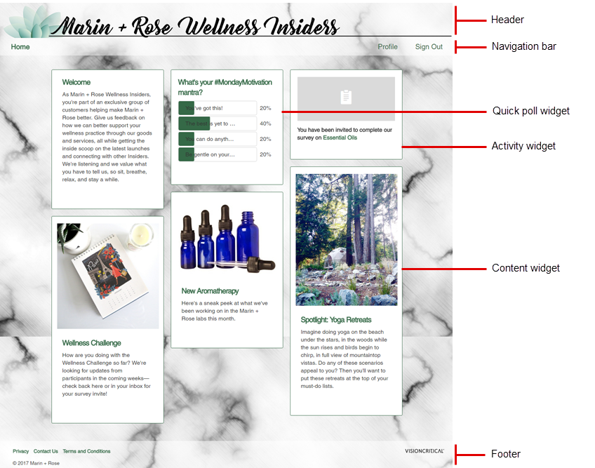
On desktop, portal content is arranged in a 3-column layout. Widgets span one column and have a width of 320 pixels; the height of each widget automatically adjusts to fit the content. New widgets appear at the top of the portal page; however, you can change the order in which widgets are displayed.
The following image is an example of the portal home page that members
see when they sign in on a computer. You can use community themes to customize
the portal's appearance.

| Portal element | Description |
|---|---|
| Header |
Add your organization's header to the topmost part of the portal to enhance the portal's branding. |
| Navigation bar |
The navigation bar lets members easily access various portal pages. This area contains:
|
| Quick poll widget |
Add a quick poll to the portal to engage members and collect feedback, one question at a time. |
| Activity widget |
Members will see individual activity widgets for each activity that they have been invited to. Members can click the activity name to launch the activity. Activity widgets disappear when a member completes the activity or when an activity closes. Note: It may take a Power Survey widget a few minutes to
disappear from the portal.
|
| Content widget |
Add engaging content such as text, images, and videos. You can add as many content widgets as you like, reorder widgets, or add an internal widget name that is not visible to members. |
| Footer |
The footer contains any messages or links that you added when you edited the community's settings. You can insert links or upload files that contain useful information, such as:
The footer also appears at the bottom of forum pages. |
Mobile view
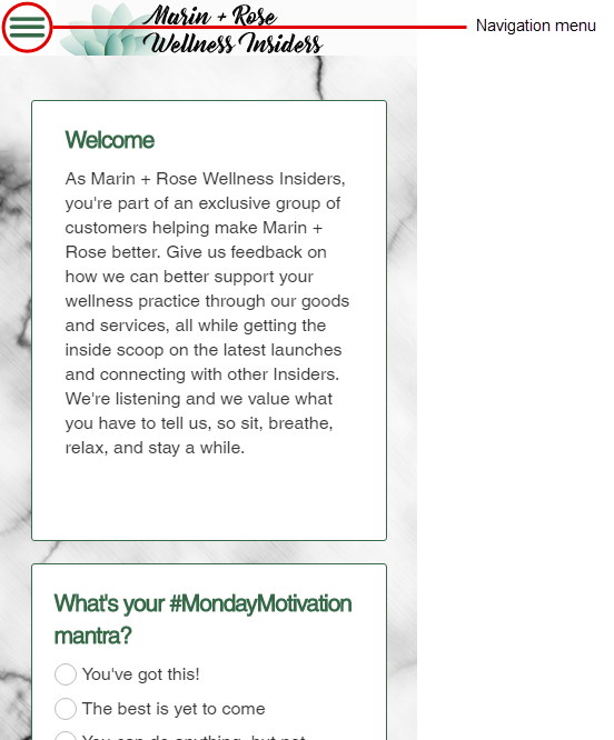
When members sign in to a portal on their mobile devices, the appearance of the portal home page is slightly different because it is optimized for a smaller screen.
- A smaller header is displayed at the top.
- The navigation bar becomes a menu icon in the top left, which members can tap to collapse or expand navigation options.
- On smaller screens, the widgets stack on top of each other.
