The community theme determines the appearance of the community's
login and signup pages, and activities, in desktop and mobile view.
Refer to this topic as you
create a new
community theme with the theme editor open. The sections in this topic
correspond to the headings in the theme editor.
To access
the theme editor, click the
App Drawer and select
Theming .
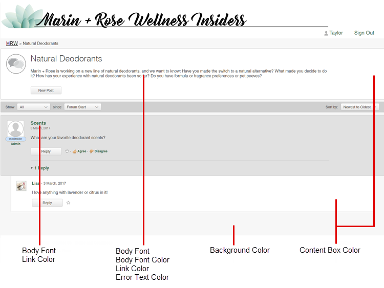
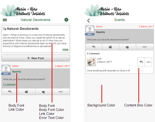
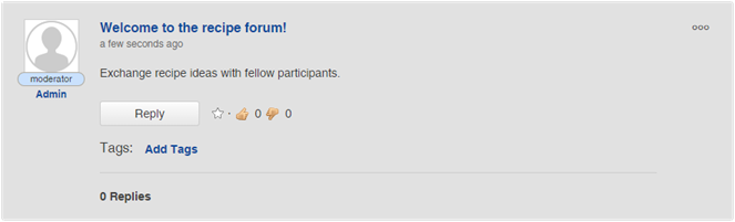
Discussions
Page and theming elements
Notes, tips, and considerations
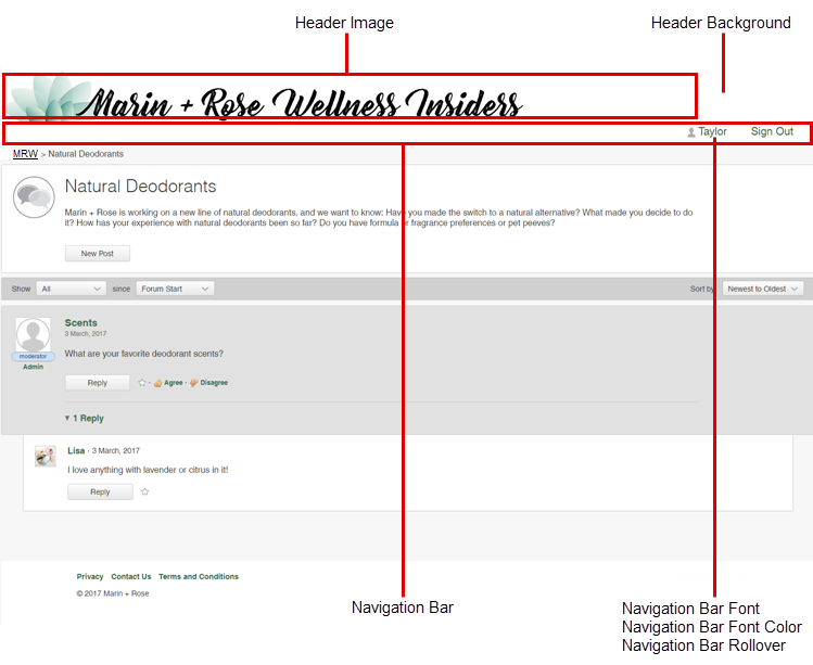
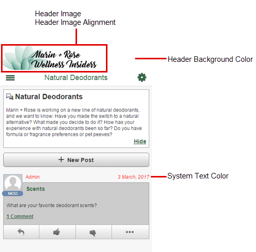
Forum (desktop view):
The header image does not
adjust to the size of the member's browser window. If the member's browser
window is less than 1615 pixels wide, the right side of the header will appear
cut off. When designing your header put any branding on the left side.
Pick a
Header Background color that
matches the header image's background color.
That way, if members are viewing the forum on a screen
wider than your header image, the header will still appear contiguous.
Alternately, use
header images with a transparent background.
Note: If the community
locale is set to an Asian language, the only available font options are
Serif and
Sans-Serif.
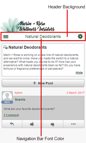
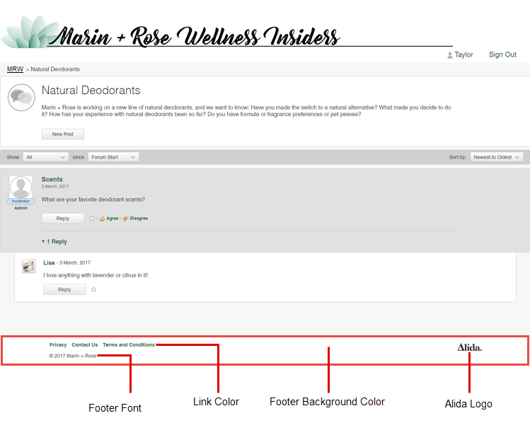
The footer looks
the same in desktop and mobile view. However, in mobile view, footer links and
logos may be stacked instead of being displayed straight across the screen to
account for the smaller screen display.
Surveys
Table 1. Classic surveys
Page and theming elements
Notes, tips, and considerations
Survey (desktop view):
The desktop header does
not adjust to the size of the member's browser window. If the member's browser
window is less than 987 pixels wide, the right side of the desktop header will
appear cut off. When designing your desktop header put any branding on the left
side.
The following
fonts are available:
Arial
Georgia
Hand of Sean
Helvetica
Montserrat
Open Sans
Raleway
Roboto
Times New Roman
Verdana
Note: If the community
locale is set to an Asian language, the only available font options are
Serif and
Sans-Serif.
Pick a color that
matches the header image background. That way, if members are viewing the
survey on a screen wider than your header image, the header will still appear
contiguous.
Alternately, use a
transparent image and choose a background color that reflects your branding.
The footer looks
different in mobile view. In mobile view, the links and footer text are inside
a menu and the footer logo is not displayed.
The maximum number
of characters for footer text is 512.
Table 2. Modern surveys
Page and theming elements
Notes, tips, and considerations
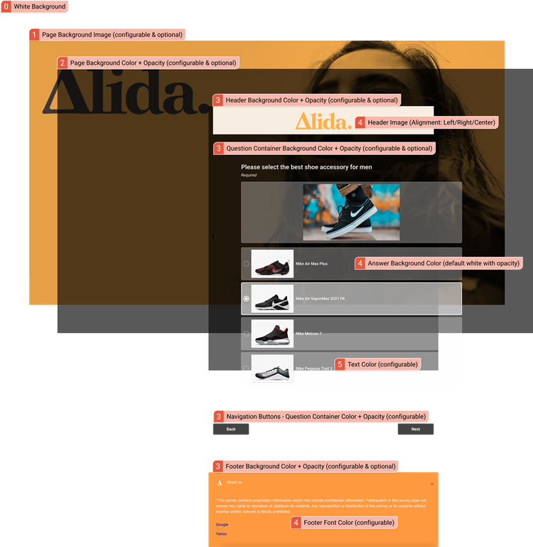
How modern survey theming works
You can think of
the modern survey theme as a series of overlapping layers:
A white
background is the default.
If you set a
page background image, it will appear on top of the white background.
If you set a
page background color and opacity, the color will appear on top of the page
background image like a tinted overlay.
The header,
question container, and footer form the topmost layer.
In modern view,
one survey view is available to all participants (desktop, mobile, and tablet).
The survey page expands or shrinks to fill the participant's device screen.
There is no distinction between desktop and mobile.
Header images and background colors
The same header
image appears across all devices and screen sizes.
Recommended
height: 100 pixels.
Recommended
width: 400 pixels
Larger images
are resized to 100 pixels height and the aspect ratio of the width is
maintained.
If you are
experiencing image blurriness, try doubling the recommended height and width in
pixels.
For the background
of your header image, solid colors work better than gradients.
Consider using an
emblem or image as a logo instead of something that features words. Once
resized, the words in header images may not appear as crisp and may become
blurry.
The header does
not adjust to the size of the participant's screen. To avoid unintentionally
cropping the header image on smaller screens, try:
Using a
narrower header image.
Experimenting
with
Header Alignment options.
Left-aligning
the visual elements within the image.
Pick a
Header Background Color that matches
the header image's background color. If members are viewing the survey on a
screen wider than your header image, the header will still appear contiguous.
Alternately, use
header images with a transparent background.
Other considerations
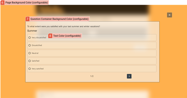
Question Container
Background Color affects the question container background,
navigation buttons background, and pop-up background.
For the
Page Background Image, follow these
guidelines:
Maximum file
size: 2 MB
Recommended width: 1920 pixels
Recommended
height: 1080 pixels
Text
Color affects question, instruction,
"required," pop-up, and answer text. It also affects the
answer border and navigation buttons border.
The following
fonts are available:
Arial
Georgia
Hand of Sean
Helvetica
Montserrat
Open Sans
Raleway
Roboto
Times New Roman
Verdana
Note: If the community
locale is set to an Asian language, the only available font options are
Serif and
Sans-Serif.
The maximum number
of characters for footer text is 512.
Surveys (Classic) Mobile
Table 3. Classic surveys
Page and theming elements
Notes, tips, and considerations
Survey (mobile view):
The following
fonts are available:
Arial
Georgia
Hand of Sean
Helvetica
Montserrat
Open Sans
Raleway
Roboto
Times New Roman
Verdana
Note: If the community
locale is set to an Asian language, the only available font options are
Serif and
Sans-Serif.
Pick a color that
matches the header image background. That way, if members are viewing the
survey on a screen wider than your header image, the header will still appear
contiguous.
Alternately, use a
transparent image and choose a background color that reflects your branding.
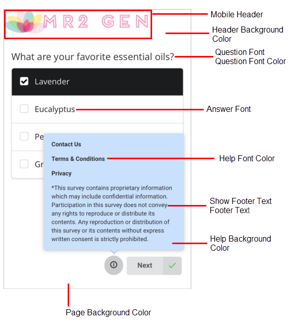
Show
Footer Text
and
Footer Text are set under
Surveys.
The maximum number
of characters for footer text is 512.
Mobile surveys in modern view
use the page and theming elements under
Surveys. For more information, refer to the
Modern Surveys table.
Email Branding
Some
Surveys Mobile theme elements also control the
branding and appearance of emails sent to members.
Page and theming elements
Notes, tips, and considerations
Email invitation (desktop view):
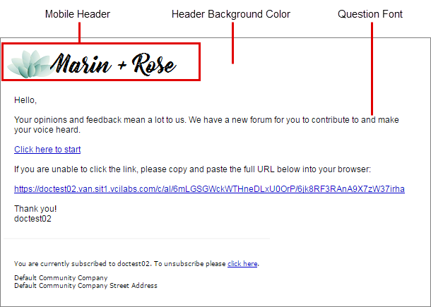
The
Mobile Header image appears in a
banner that is 600 pixels wide, at the top of the email. The image is aligned
to the left and resized if it exceeds 640 pixels in width.
The
Header Background Color controls the
background color of the banner, at the top of the email.
Tip: Pick a color that matches the header image
background. That way, if members are viewing the survey on a screen wider than
your header image, the header will still appear contiguous.
Alternately, use
a transparent image and choose a background color that reflects your branding.