Community size
Community Size metrics show the current size of your community, as well as loss and growth trends over time. Use community size metrics to plan upcoming recruitments and identify any anomalies in the number of members lost that need be investigated.
To access the Community Size page, click the App Drawer and select .

By default, Community Size metrics show the current size of your community, plus trends from the previous six months. Use the Time Range selector to change the period and see the total number of members gained, lost and the net change over the selected time period (3, 6, 12, or 18 months).
If you have multiple communities, the size metrics show the combined number of members and loss/gain statistics for all communities. To view the metrics for one community at a time, use the community variable to filter your data. For more information, see Filter community metrics.
Community size metrics
The Community Size chart shows the number of members joining and leaving the community over time. As you hover over a trend line, a dialog shows the number of members Lost and Gained, as well as the Total Size for the specific month.
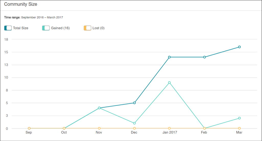
The following table describes the trend lines in the Community Size metrics:
| Trend line | Description |
|---|---|
| Total Size | The count of distinct members where the member status is Active by the end of the given month, or the current month. |
| Gained | The count of distinct members where the member status is Active by the end of the given month, or the current month and the member status did not exist or was not Active at the end of the previous month. |
| Lost | The count of distinct members where the member status is Undeliverable, Unsubscribed or Purged at the end of the given month or the current month and the member status was Active at the end of the previous month. |
Loss Analysis chart
The Loss Analysis chart shows trends of member loss over time. As you hover over a data point on the trend line, a tooltip shows the count for each Purged, Undelivered, or Unsubscribed status for the specific month.
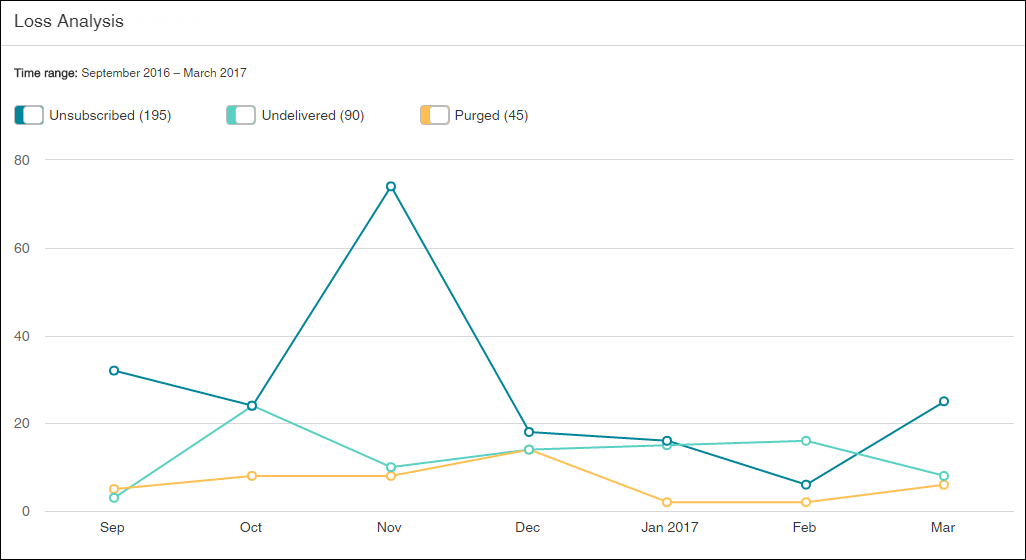
The following table describes the trend lines in the chart:
| Trend line | Description |
|---|---|
| Purged | The number of times members were removed from the community. |
| Undelivered | The number of times members did not receive invitations because email delivery failed or because a spam complaint was made. |
| Unsubscribed | The number of times members who no longer want to receive emails from the community requested removal from the community. |
| Example | ||||||||
|---|---|---|---|---|---|---|---|---|
The following are examples of how changing a member's status can affect whether the loss is counted in the Loss Analysis chart.
|
Why Members Are Unsubscribing
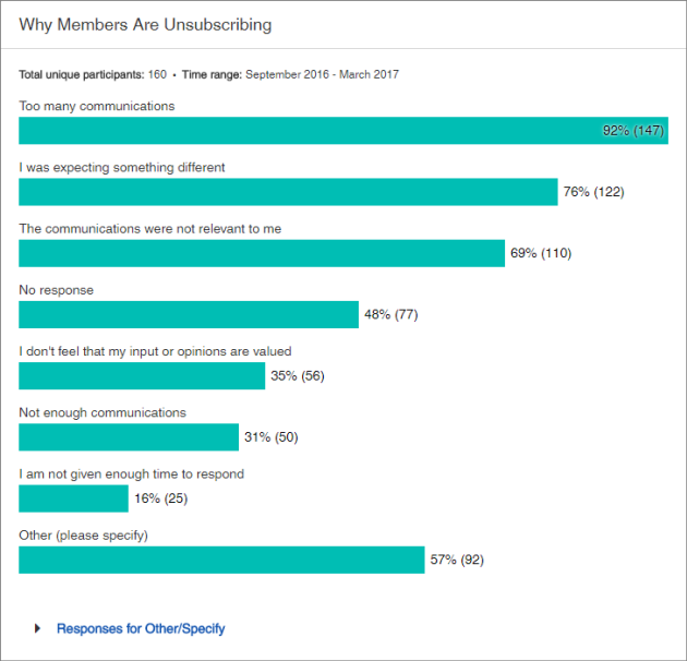
The Why Members Are Unsubscribing chart shows the reasons selected in the unsubscribe study by active members or participants who unsubscribe from the confirmation email. Selecting a reason is not mandatory when members unsubscribe.
To view the text answers with the "Other/Specify" option, click Responses for Other/Specify. You can also use the Find field to search for keywords and phrases in "Other/Specify" answers.

Community size
At the right side of the page, the Community Size value shows the total number of members marked with status of Active currently in the community. An Active member is a community member who can be invited to participate in activities.

Time Range
By default, Community Size metrics show the current size of your community, plus trends from the previous six months. Use the time range selector to change the period and see the total number of members gained, lost and the net change over the selected time period.
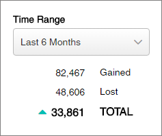
The following table describes the counts in the Time Range area of the metrics:
| Metric | Description |
|---|---|
| Gained | The total number of members gained for the specified time period, regardless of whether a new member subsequently unsubscribes, becomes undeliverable, or is purged from your community. |
| Lost | The total number of members that unsubscribed, became undeliverable, or were purged from your community for the specified time period. |
| Total | The net change in the community size for
the specified time period (total
Members Gained minus total
Members Lost).
|
To set the time range, click the selector to expand the list, and select a time period.
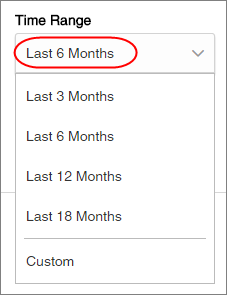
To create a custom time range:
- Click the time range selector, and select Custom.
- In the
Set Custom Time Range dialog that appears:
- Set the start Month and Year.
- Set the end Month and Year.
- Click Apply.
Show or hide trend lines
You can hide or show a trend line by turning the toggles above the metrics on or off.

Switch between chart and table views
In the View section, select:| Button | View type | Description |
|---|---|---|

|
Trends | Displays the count of the total size of your community, members gained, and members lost as a trend line. |

|
Table | Displays the count of the total size of your community, members gained, and members lost as a table. |

|
Total | Displays the count of the reasons why members are unsubscribing as a bar chart. |

