How questions are displayed
Learn more about how your data is displayed in the report.
Charts
For Choice and Grid questions, charts let you see the proportion of participants who chose specific answers at a glance. Hover over the labels and bars to view a tooltip that summarizes question or answer text, counts, and percentages.
There are slight display differences between question types:
- Choice questions display one chart per question.
- Grid questions display an individual chart for each grid row.
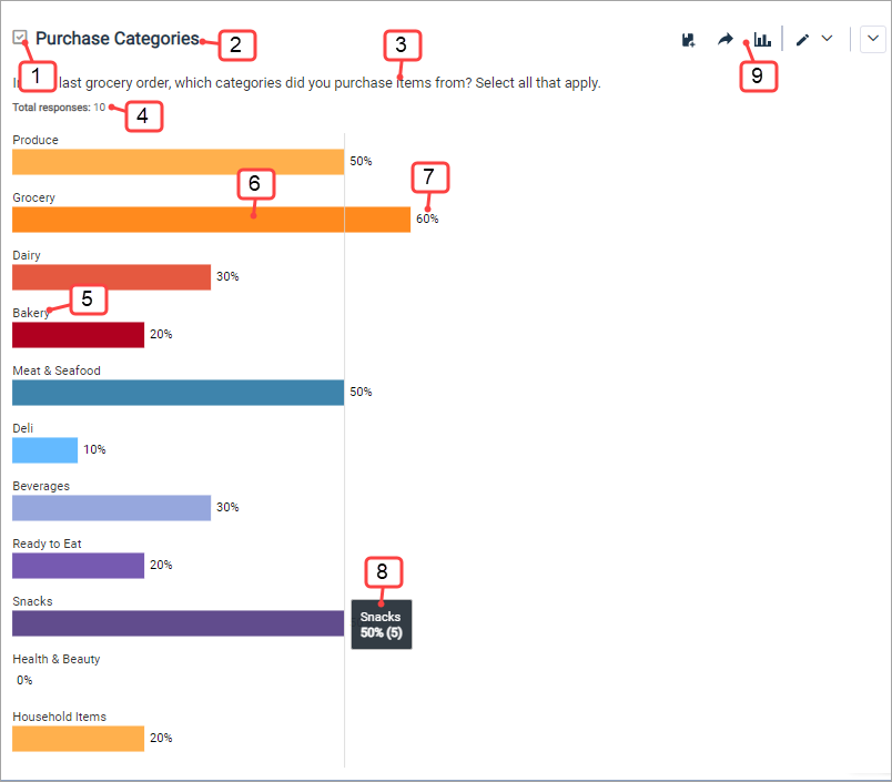
The following table corresponds to the preceding image, and describes the information displayed in each chart.
| Number | Information | Description |
|---|---|---|
| 1 | Question type icon | Indicates the question type. |
| 2 | Question name | The internal-facing name of the question in the survey. Not visible to participants. |
| 3 | Question text | The question asked of participants. |
| 4 | Total response count | The total number of times participants saw the question and clicked Next to proceed through the survey, with or without providing an answer. |
| 5 | Answer text | The answer displayed to participants.
Note: "Did not answer" may appear as an answer option if:
|
| 6 | Results | Shows at a glance how many participants selected the answer. Change the chart type to display the results in a different way. |
| 7 | Answer percentage | The percentage of participants who selected the answer. |
| 8 | Tooltip | Hover over the labels and bars to view a tooltip that summarizes question or answer text, counts, and percentages. |
| 9 | Question settings | Click the arrow on the far right of the question name to display further options at the question level. You can download the chart as a PNG file, or choose to display the question as a chart or table. |
Tables
Each question has a table that lets you see the proportion of participants who chose specific answers. There are slight display differences between each question type:
- Choice questions display one table per question.
- Grid questions display a summary table for the Grid question overall, as well as tables for each grid row.
- Rank Order questions show how many participants ranked an answer first, second, and so on.
- Allocation and Number questions display a statistics table. You can choose to show or hide mean, median, minimum/maximum, and standard deviation/standard error values.
- Date
- Highlighter
- Instruction
- Open End
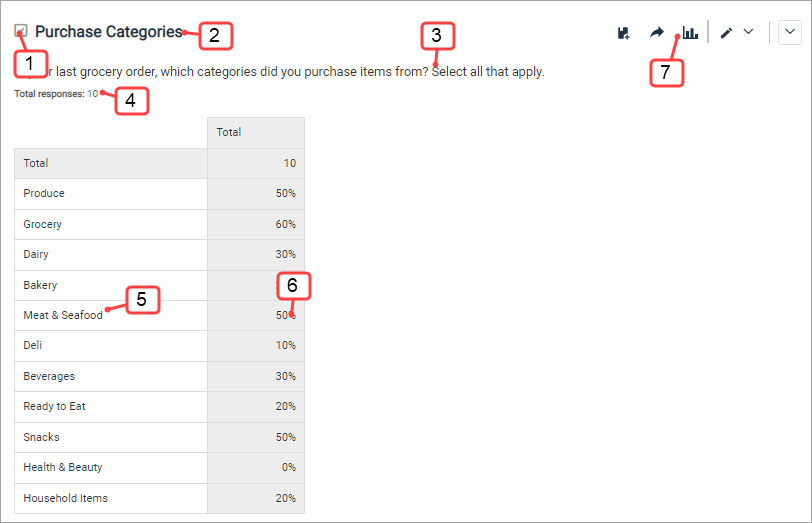
The following table corresponds to the preceding image, and describes the information displayed in each question's table.
| Number | Information | Description |
|---|---|---|
| 1 | Question type icon | Indicates the question type. |
| 2 | Question name | The internal-facing name of the question in the survey. Not visible to participants. |
| 3 | Question text | The question asked of participants. |
| 4 | Total response count | The total number of times participants saw the question and clicked Next to proceed through the survey, with or without providing an answer. |
| 5 | Answer text | The answer displayed to participants.
Note: "Did not answer" may appear as an answer option if:
|
| 6 | Counts or percentages | Shows how many participants selected the answer. You can choose to display counts, percentages, or both. |
| 7 | Question toolbar | Use the options in the question-level
toolbar to:
|
Heat maps
For Highlighter questions, a heat map visually displays which areas of the image were highlighted by participants. The heat color and the accompanying legend give the percentage of participants who highlighted each area of the image. The darker the area, the more participants who highlighted it.
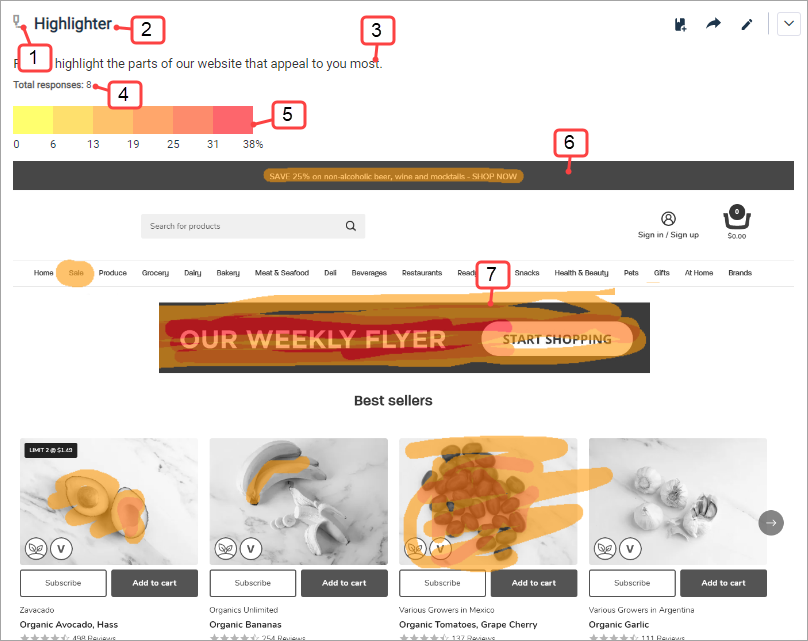
The following table corresponds to the preceding image, and describes the information displayed in each heat map.
| Number | Information | Description |
|---|---|---|
| 1 | Question type icon | Shows the question type as Highlighter. |
| 2 | Question name | The internal-facing name of the question in the survey. Not visible to participants. |
| 3 | Question text | The question asked of participants. |
| 4 | Total response count | The total number of times participants saw the question and clicked Next to proceed through the survey, with or without providing an answer. |
| 5 | Heat map legend | Explains the percentage ranges in the heat map as represented by varying shades of yellow, orange, and red. |
| 6 | Heat map image | A black and white rendition of the image that was presented to participants. |
| 7 | Heat map overlay |
Varying shades of yellow, orange, and red indicate the percentages of participants who highlighted each area. For example, 28-33% of participants highlighted the red area on the right, while lower percentages of participants highlighted the orange and yellow areas. If you apply a filter to the report, the heat map overlay will also display filtered results. However, you cannot apply subgroups to heat maps. |
| Why do I see a message when I view my report? |
|---|
Community can only display one heat map image at a time. If you translate a Highlighter question in a Power Survey, then upload a different image for each language, you will see a message when you view the report. To view the heat map, filter your report on the member locale you used to translate the question. For example, . In most cases Community will create one heat map when you use the same image for each language. However, for the most accurate data, we recommend filtering the report by the member locale. |
Net Promoter Score℠
Net Promoter Score℠1 questions display the Net Promoter Score (NPS®), which is calculated by subtracting the percentage of Detractors from the percentage of Promoters. The NPS® can range from -100 (everyone is a Detractor) to 100 (everyone is a Promoter). An NPS® close to 0 means the number of Detractors and Promoters is roughly equal.
Below the NPS®, a chart displays the breakdown for Detractors, Passives, and Promoters. You can also view this breakdown as a table.
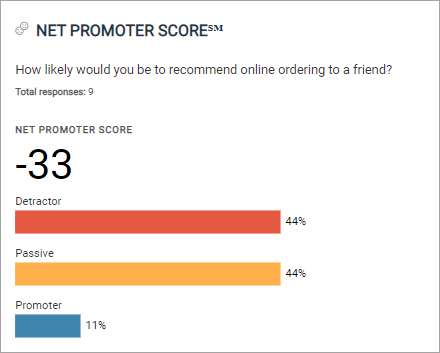
To see the exact NPS® each participant gave, and responses to follow-up questions, you must export the report as a CSV file.
MaxDiff
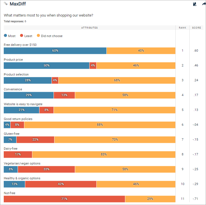
MaxDiff questions display the following information for each attribute:
- A breakdown of how often the attribute was most preferred, least preferred, or seen but not chosen.
- How the attribute ranks in comparison with other attributes. (This rank is based on the score.)
-
A score which is calculated using the following formula:
Score = (# of times the attribute was selected Most - # of times the attribute was selected Least) / (# of times it appeared)
The score can range from 1 (the attribute was chosen as most preferred 100% of the times it was displayed) to -1 (the attribute was chosen as least preferred 100% of the times it was displayed).
- The higher the score, the more appealing the attribute is to participants.
- If the score of one attribute is twice as large as another attribute's, it means the former attribute is twice as appealing as the latter.
- A positive score means the attribute was selected as most appealing more often than least appealing.
- Conversely, a negative score means the attribute was selected as least appealing more often than more appealing.
- A score of 0 means the attribute was chosen as least and most appealing an equal number of times.
Choice-Based Conjoint
Choice-Based Conjoint data is displayed in its own report. For more information, see The Choice-Based Conjoint Report.
Video Feedback
Video Feedback data is displayed in its own report. For more information, see The Video Feedback Report.
Open End
Open End responses are displayed in text analysis. For more information, see Text analysis.
